Mapping Votes
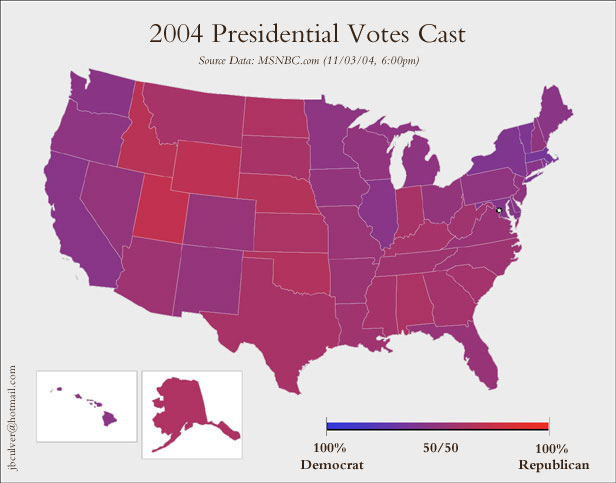
What do these two maps ("Purple," "Counties") tell us about American politics? Which map do you think is more representative of American political discourse? Which map would you like to be more representative? Thanks to Anne Galloway for the concept.
posted by chutry @ 8:40 AM
2 comments
![]()

2 Comments:
A great post. This post gave me an idea for one that I posted on my blog today entitled "A Moderate and Proud of It; Purple and Proud of It." I do enjoy this blog, and keep up the good work.
My blog is www.CrackerSquire.blogspot.com and I will post the specific post as well:
http://crackersquire.blogspot.com/2004/11/moderate-and-proud-of-it-purple-and.html
Thanks, Sid. I like that the purple map creates a sense of confusion. Some of my students commented that the "purple" map even made it hard to see state boundaries, making it impossible to "read."
I've enjoyed reading your blog, too. Keep up the good work.
Post a Comment
<< Home